Understanding the Insight Summary
This article explains how to access and interpret key performance metrics in the Ignite Insight Summary. You’ll learn how to review visitor data, audience engagement scores, and conversion activity to make data-driven decisions about your website’s performance.
Watch this video tutorial to see the Insight Summary in action:
Step-by-Step Instructions
1. Access the Insight Summary
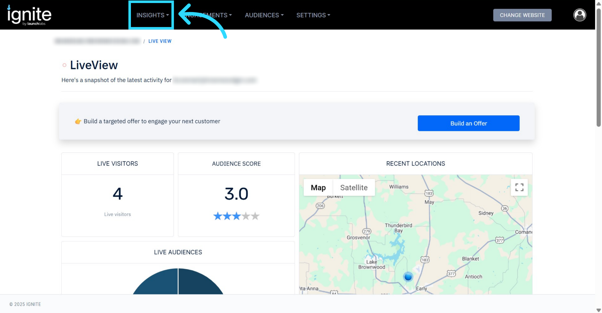
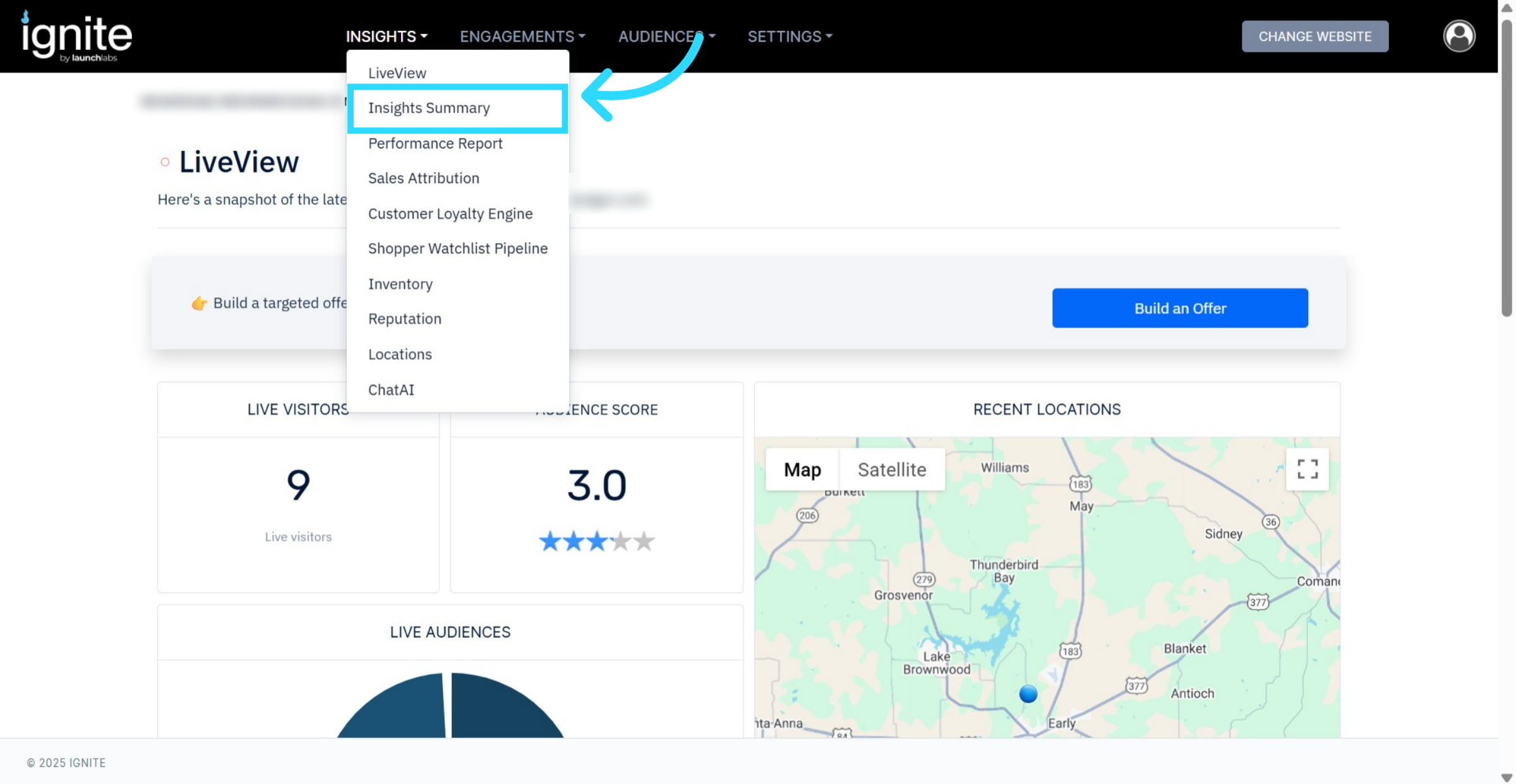
In the top navigation bar, click Insights.
Then select Insights Summary to open the performance overview dashboard.
You can view data for three time ranges:24 hours (rolling period)
7 days
30 days — recommended for the most comprehensive insights
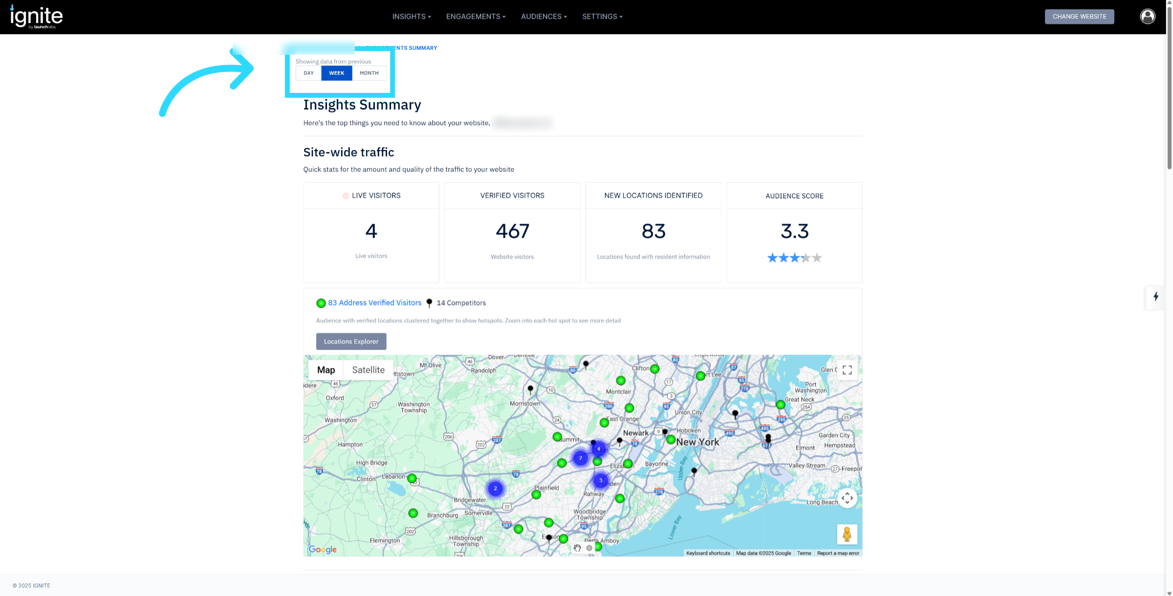
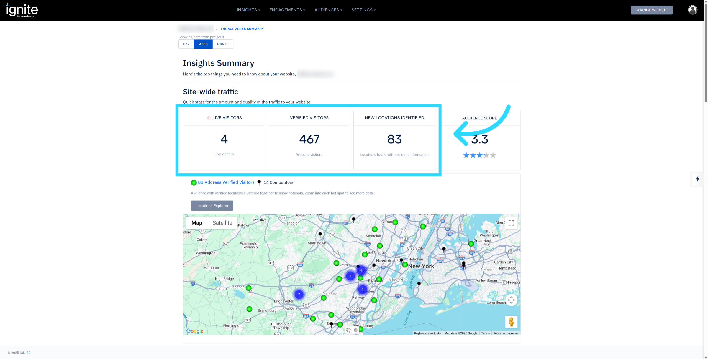
2. Review Traffic Metrics
Live Visitors: Shows users currently active or active within the last 2 hours.
Verified Visitors: Displays all unique visitors tracked during your selected time range.
New Locations Identified: Indicates the number of newly de-anonymized shoppers identified at a household level that were not already in the platform’s records.
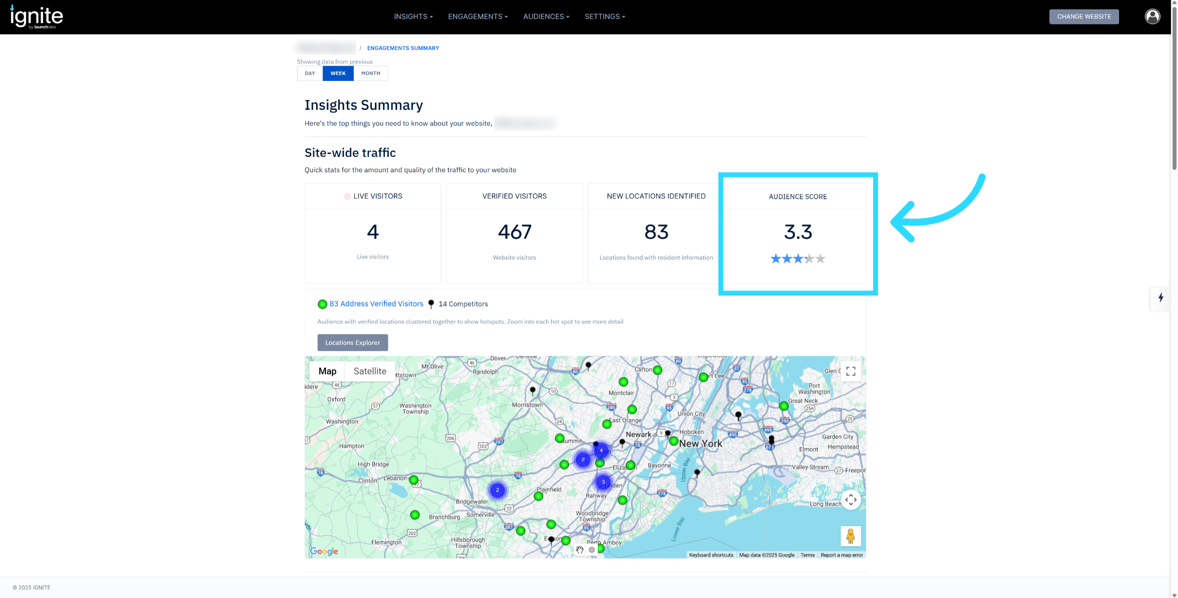
3. Understand Audience Score
The Audience Score is a predictive index showing where customers are in the buying funnel:
⭐ 1 Star: Early in the research phase.
⭐⭐⭐⭐⭐ 5 Stars: Deep-funnel — visitors likely near the point of purchase (e.g., viewing finance pages or product details, or returning to the site multiple times).
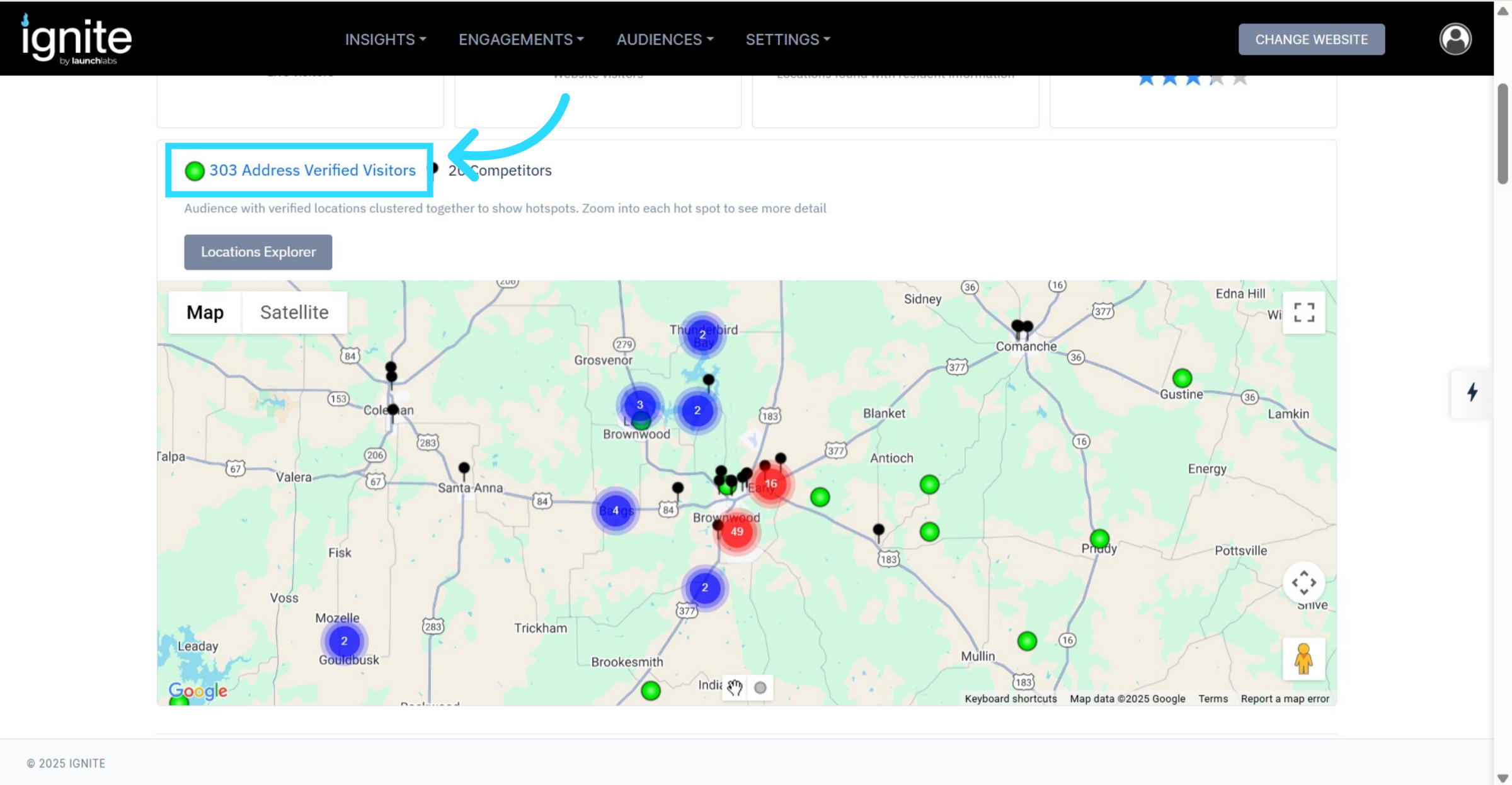
4. Address-Verified Visitors
Address verified visitors are customers that the platform is de-anonymizing and locating at a home address level. This is tracked both in the shopping market. as well as nationwide, anywhere the platform sees a visit to the website. You can click on the address verified visitors to see the list.
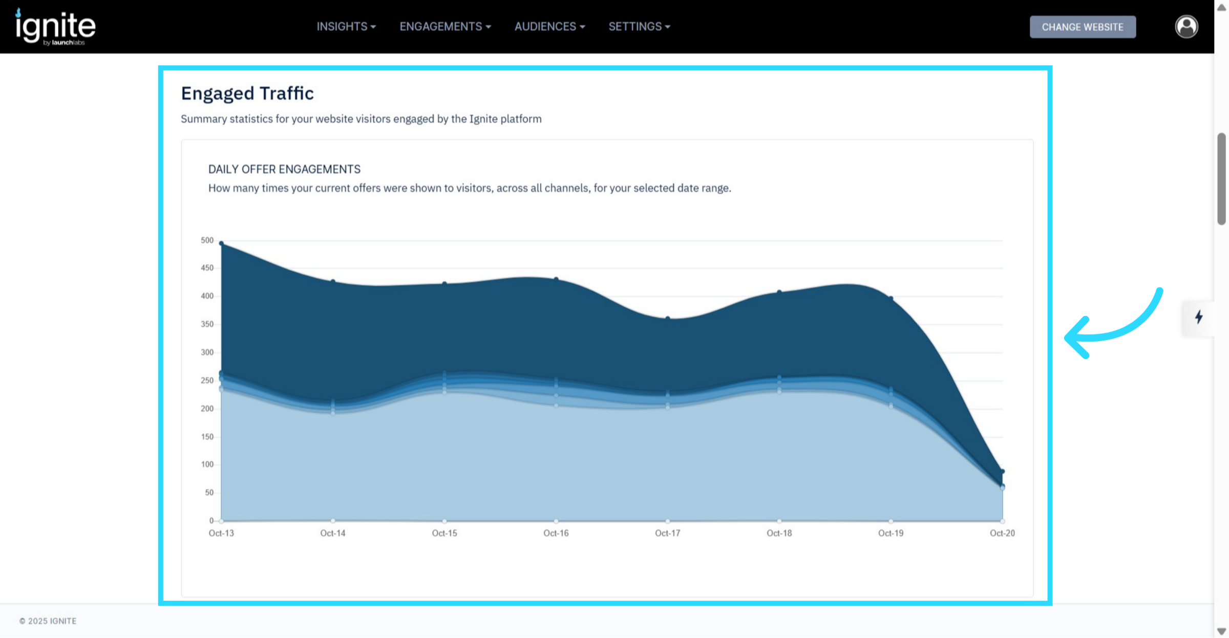
5. Analyze Engagement Metrics
Engaged Traffic: Shows how often engagement tools (offers, pop-ups, etc.) are triggered on the site.
Shoppers Engaged On Site: Displays the number of visitors who interacted with at least one engagement element during their visit.
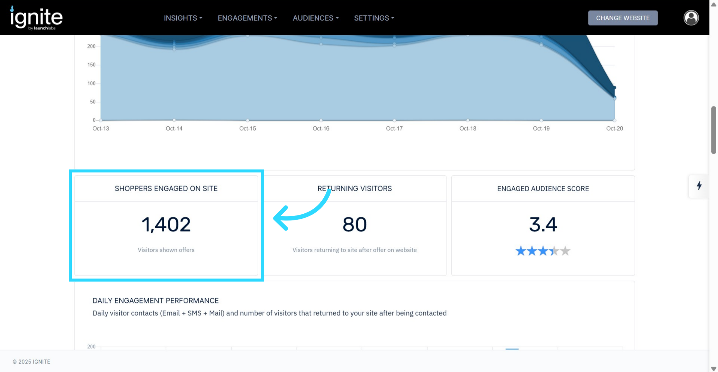
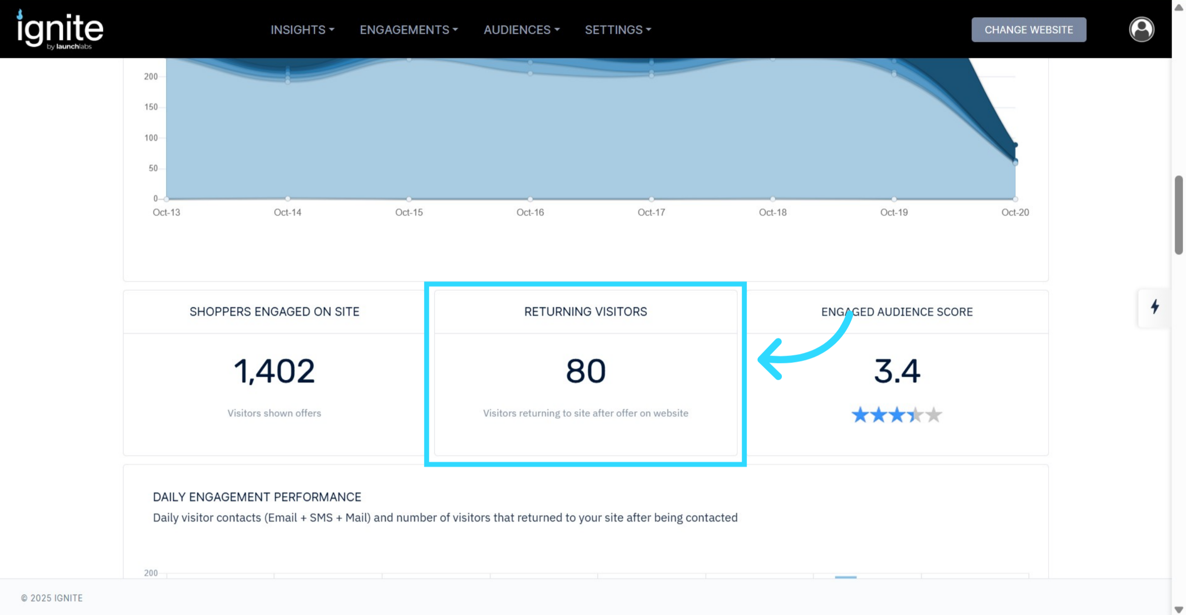
6. Returning Visitors
The Returning Visitors section highlights users who have come back to your website after an initial visit. Returning visitors typically represent higher-quality leads and may be returning via direct visits, paid ads, or email campaigns.
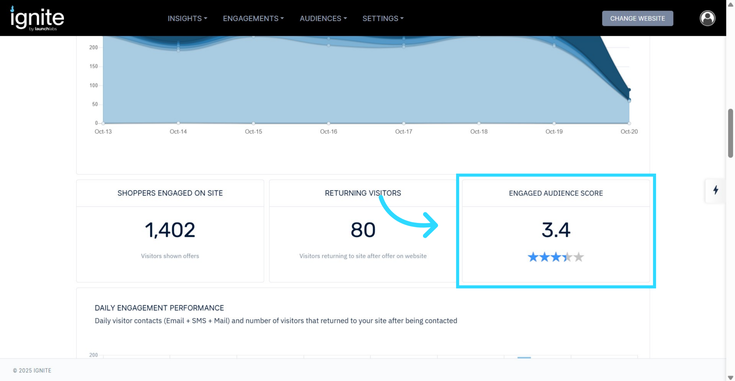
7. Engaged Audience Score
The Engaged Audience Score represents users who have interacted with offers or engagement tools. This score is usually higher than the general audience score, indicating successful nurturing that moves shoppers further down the funnel.
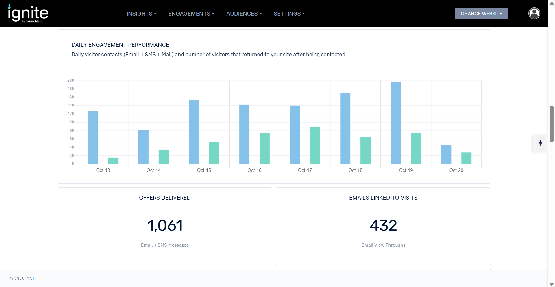
8. Daily Engagement Performance
This section tracks:
Emails Sent and Clicked: Daily counts of outbound emails and engagement with them.
Offers Delivered: Combines both email sends and text message conversions.
Emails Linked to Visits: Tracks when users return to the site via email links.
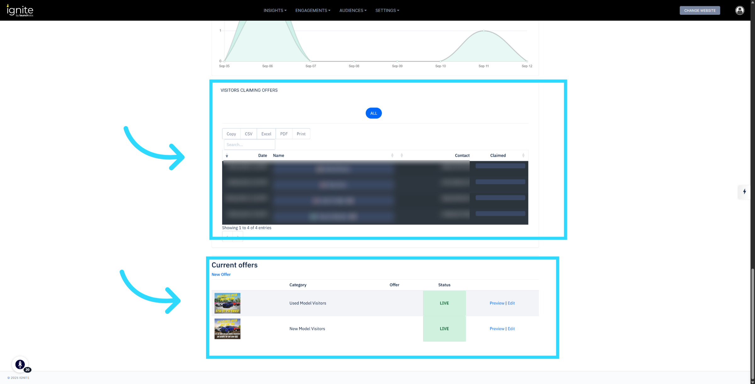
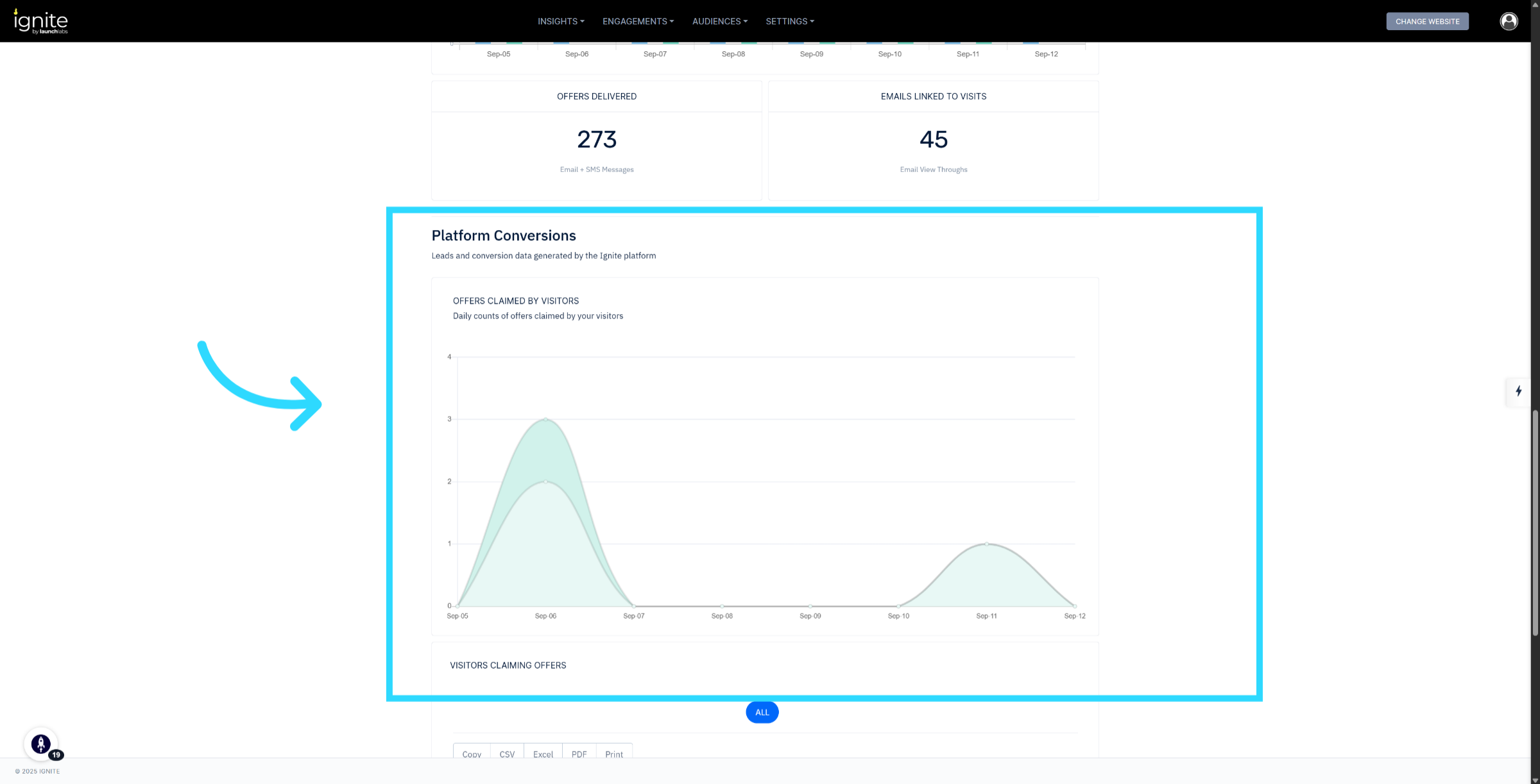
9. Review Platform Conversions and Current Offers
Platform Conversions: Shows daily offer claim counts from your website.
Visitors Claiming Offers & Current Offers: Displays which visitors claimed offers and the active offers currently running on your site. You can sort or export this data for further analysis.